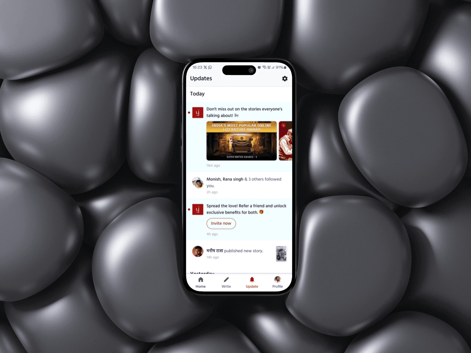
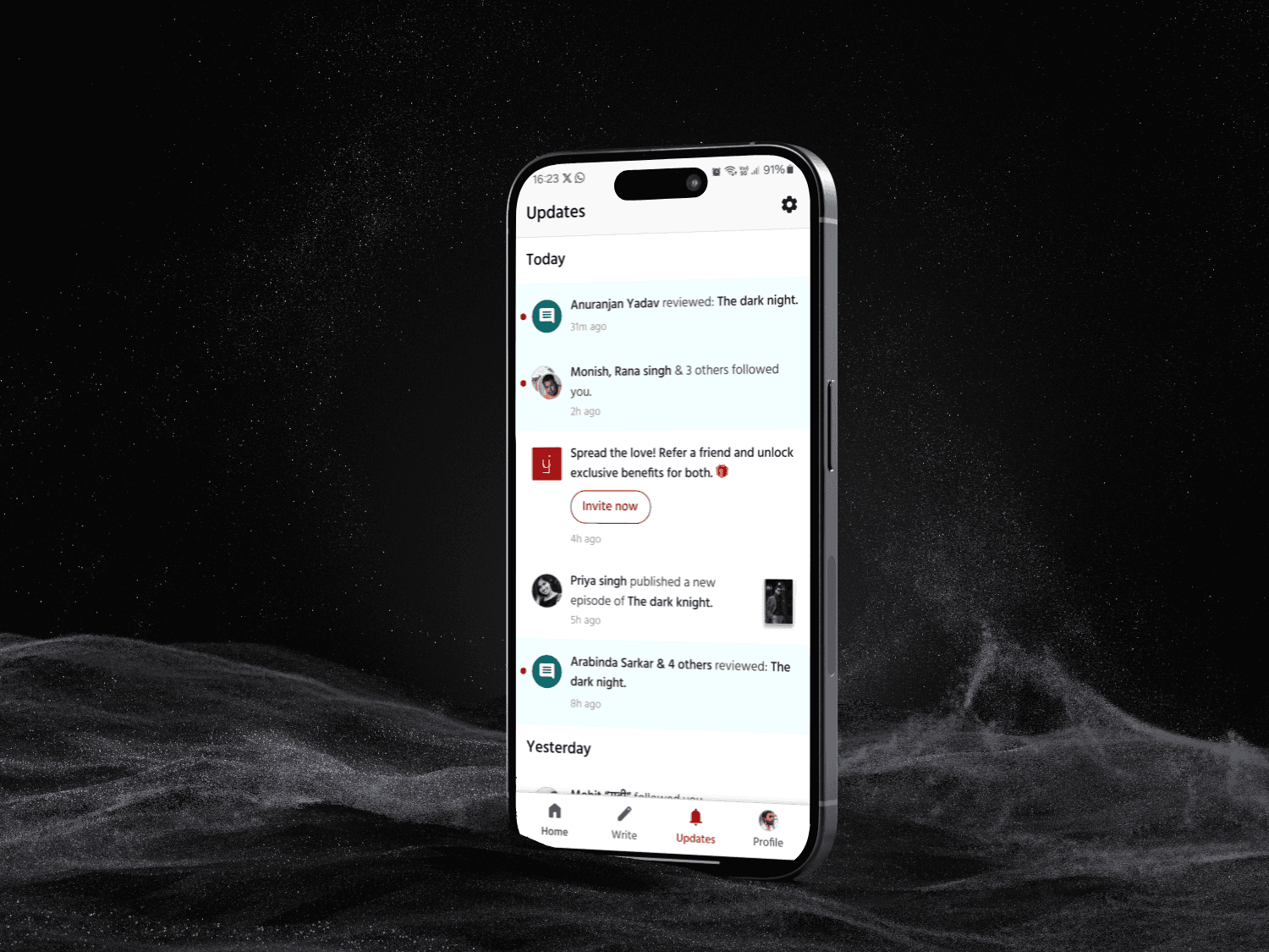
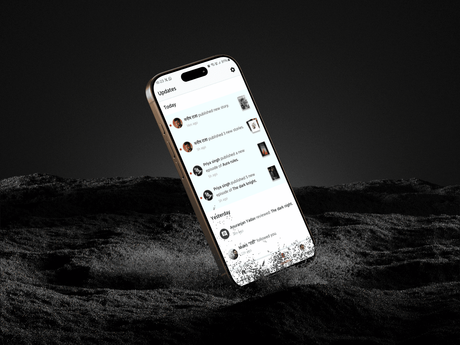
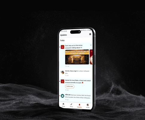
Pratilipi: Notification section redesign

Elevating the UX of the update section by decreasing the time in user's decision making.

Role

Product Designer

Industry

Books & Storytelling

Duration

2 weeks

a mobile phone showcasing Pratilipi's update section design

Context:

Users had to scroll a lot through numerous types of notifications to find the one’s they want to interact w/. This process took time.

User Stories:

  1. As a user (writer/reader) I want to:

Differentiate notifications in a quick scan. So that I don’t miss out any (review/content) notifications.

  2. As a User I don’t want to: Scroll a lot through update section. As it increases user effort, clutters the update section.

  3. As a writer I want to:

Know details about events hosted by Pratilipi. So that I can build content, audience & win prizes along the way.

  4. Because update section gets the most engagement after home... Pratilipi wants to:

Use this opportunity 


To increase their revenue by nudging users towards Pratilipi premium or referring friends.

Core Pain points:

  • A lot of scrolliinnnggggg

  • Hard to skim & caused confusion

  • Increase in decision making time

Objective:

To create better user experience for writers & readers by decreasing the time in users decision making.

Competitive Analysis & Visual design:

Through competitive analysis I discovered few interesting patterns like:
1. Use of copy in notification
2. Design elements like shapes, colors & icons for differentiation

Based on which I went ahead & started visual design process & below are the final results for the same.

Promotional notifications for writers on Pratilipi
Transactional notifications for writers on Pratilipi
Transactional notifications for readers on Pratilipi

Potential Business Impact:

Because of redesign we can safely say that it will be easy for users to skim through different types of notifications & decide quickly on which notification to interact with, due to which:
Engagement with notification will increase - Higher content discoverability - Improve content recognition performance - Increase retention.

Other projects

Copyright 2024 by Rinkesh Bist

Copyright 2024 by Rinkesh Bist

Copyright 2024 by Rinkesh Bist